Client
MA Non Linear Narrative
Year
2022
Disciplines
Visual Language, Conception
collaborators
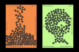
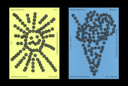
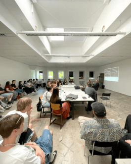
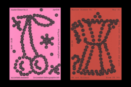
The Master Dinners are a series of dining events as a platform to encourage social exchange and collaboration across departments within the Royal Academy of Art, The Hague. Every month, a different MA program had to organize their event.
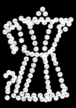
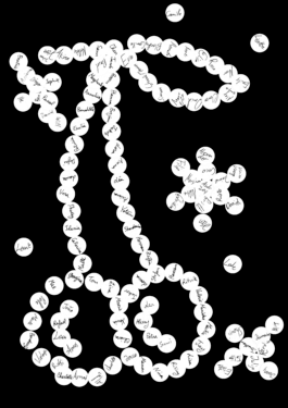
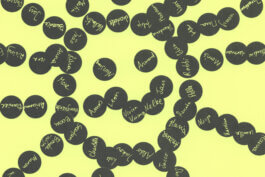
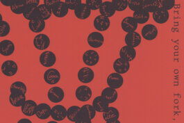
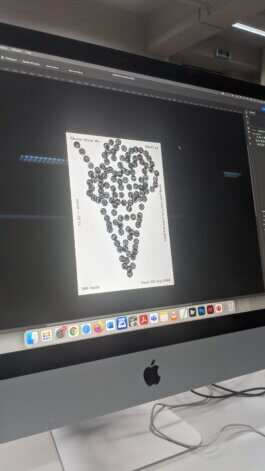
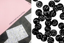
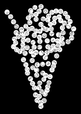
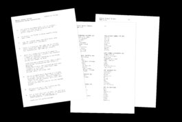
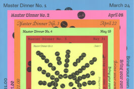
Social dynamics of hosting, organising and dining together are translated into the guiding principles for this poster series: Each MA program was provided with a poster template, stickers and list of names of all invited students. One name per sticker, the stickers were distributed within the group. These served as elements to design one motif each, representing the respective event. Pre-drawings or elements other than the stickers were not allowed. By this, spontaneous collaboration interlocked with collective thinking offers a participatory experience that works against conventional mechanisms of capitalistic perfectionism. In addition, the design already begins to engage with the participants - who is Lisette, Georgina or Alexey?
Process
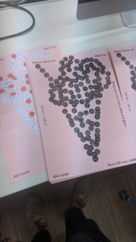
The Master Dinners are a series of dining events as a platform to encourage social exchange and collaboration across departments within the Royal Academy of Art, The Hague. Every month, a different MA program had to organize their event.
Client
MA Non Linear Narrative
Year
2022
Disciplines
Visual Language, Conception
collaborators
Process
Together with Pauline Gebauer I presented Neomatter and spatial type to the communication design students of FH Dortmund, specifically to the class of Andreas Ruhe (Morphoria) and Lars Harmsen (Slanted Publishers).
By example of our personal paths we showed them how Neomatter evolved, what is hot right now, where we are heading and how to work with 3-dimensional type.
The class is currently editing and designing the next edition of Slanted’s series of Experimental Type, guided by their tutors. Since many students work with 3D already or would like to explore the thematic, they invited us to gain insight from externals. Students will be provided with trials, we can’t wait to see them applied!
Thanks a lot for the invitation, attention and participation in discourse through questions or remarks.
Photo by Andreas Ruhe
Studio Daniel Gremme is working on a new website design for artist Karin Kytonkagas.
While living and working in Den Haag, her work is exhibited in many places, showing off predominantly paintings which can be described as humoristic, soft and trigger curiosity of the world around us. She wants art to be "more romantic, dreamy and escapistic”, and at the same time she translates "soft things into powerful statements.”
In a first meeting we spoke about her as an artist and reflected on how she wants to situate herself in the (art) world. A big step was to find a word for all the little and quick works she is producing next to her time consuming and at times large paintings: Ephemerals.
In collaboration with my colleague Camille de Noray I am working on a new website of the Tahitian Architect Bertrand Portier. His studio is specializes in architecture for tropical climate conditions and is one of the biggest in Tahiti. We'll share the results!
Neomatter has been selected for the Design Grant Scheme by @stimuleringsfonds (Creative Industries Funds NL). 💐
This project-bound grant will finance the development of a plugin for spatial typography. It allows to write out 3D letters on splines within Blender and Cinema4D, including several typographic functions. As a plugin, it can be seamlessly integrated into existing workflows.
With respectable experience in both typographic and spatial projects, we’re super glad to have @pointer_studio (Studio Pointer) by our side, who will develop the plugin for and with us. Specialized in media alchemy and software fiction, they are known to be called for things no one tried before, such as a variable font editor, on-spot and real-time 3D scanning of humans and astrophysical simulations.🪄
We can’t wait to run down the springboard and catapult this tool into the creative hands worldaround. A huge thanks to @stimuleringsfonds for their support!
From the 20th to the 24th of March 2023, I had the delightful opportunity to teach students from the Environmental Art Department at the Art Academy of Latvia in Riga.
The workshop, titled "Unleashing Letters," provided a unique blend of theoretical and practical aspects, aiming to transcend the realm of aesthetics. We delved into in-depth discussions about their individual projects to explore how they can conceive their work on a broader scale (political, social, etc.) and use typography to communicate their subjects subtly. Practically speaking, the students designed a typographic poster for their upcoming exhibition.
To begin, we closely examined the intricacies of Garamond, swiftly grasping its skeletal structure, the interplay of shapes, and how the tool's stroke shapes the outlines, among other aspects. To expand their understanding of the diversity in typography, we visited the Brasa Graveyard. Even in such a place rich in aesthetic connotations, students discovered a plethora of distinct letterforms that served as inspiration for developing their own lettering styles.
Throughout the workshop, most students chose to work on their posters using analog methods, allowing for rapid exploration and avoiding the need for specialized type design software. Additionally, I delivered public presentations on typographic storytelling, research methodologies in art, discerning good and bad typography, and shared insights from my own practice.
The students' remarkable progress in typography within just five days is truly commendable, considering most of them were novices in the field. Their ability to achieve such high-quality work in such a short period is truly impressive.
I would like to express my heartfelt gratitude to the Environmental Art Department, particularly Martins Vizbulis (Head), Linda Vilka, Līga Spunde, and Asnāte Balode, for their invitation to teach at the Art Academy of Latvia. Their support and collaboration made this workshop possible, and I am grateful for the opportunity to work with such talented and enthusiastic students.
The workshop has been funded by the EU Erasmus program and the Latvian State.
participating students
Ļena Kiseļčuka
Everita Vītola
Paula Ikase
Polina Bule
Raimonds Krastiņš
Katrina Lipšāne
Mareks Ziemelis
Hugo Pētersons
Dana Vetrova
Together with Alex Valentina and Vincent Wagner I will speak at the. Type Drives Culture Conference, organized by the Type Directors Club in New York.
After giving insight into the reasoning behind our 3D work, each of us will share individual experiences and discoveries in exploring digital and analog methods, the ongoing technological evolution and its inevitable impact on the physicality of Type. We will then invite the audience to an open discussion on key differences, commonalities and problems as well as the potential of 3D type.
Type and Technology. Spread over two classes I had the pleasure to give Glyphs and Cinema 4D Introduction Workshops at my former university Hochschule Düsseldorf/Peter Behrens School of Arts to the students of Prof. Holger Jacobs.
Class 01: Along basic theory about type design and technical knowledge they got introduced to the Glyphs interface and functions.
Class 02: In addition to a small lecture about my research on three-dimensionality and type the students will get an insight into basic principles of three-dimensional modelling, texturing and rendering in view of their class which is all about the creation of imaginative signs.
Nice to be back for two days. 📐
I'm releasing my first typeface Skanaus at The Designers Foundry!
Skanaus is pending between a classic approach and a wild, youthful contemporary attempt that urges for new shapes and is caried by a romantic attitude. Display, Display Alternate and Regular can be used on their own or in symbiosis.
It comes in 2 styles + 1 stylistic set, supports 219 languages and contains 551 glyphs inclusive 40 ligatures.
The Designers Foundry is retailing a selected catalogue of typefaces by independent designers around the world. TDF licensed typefaces to clients like Apple, Nike, Netflix, MTV, Virgin, Random House, Dolce and Gabbana, GAP, EA Games, Pentagram, ESPN and the BBC to
name a few. Thanks to Daniel McQueen and TDF.
thedesignersfoundry.com/skanaus
Together with Pauline Gebauer I presented Neomatter and spatial type to the communication design students of FH Dortmund, specifically to the class of Andreas Ruhe (Morphoria) and Lars Harmsen (Slanted Publishers).
By example of our personal paths we showed them how Neomatter evolved, what is hot right now, where we are heading and how to work with 3-dimensional type.
The class is currently editing and designing the next edition of Slanted’s series of Experimental Type, guided by their tutors. Since many students work with 3D already or would like to explore the thematic, they invited us to gain insight from externals. Students will be provided with trials, we can’t wait to see them applied!
Thanks a lot for the invitation, attention and participation in discourse through questions or remarks.
Photos can be found here
Studio Daniel Gremme is working on a new website design for artist Karin Kytonkagas.
While living and working in Den Haag, her work is exhibited in many places, showing off predominantly paintings which can be described as humoristic, soft and trigger curiosity of the world around us. She wants art to be "more romantic, dreamy and escapistic”, and at the same time she translates "soft things into powerful statements.”
In a first meeting we spoke about her as an artist and reflected on how she wants to situate herself in the (art) world. A big step was to find a word for all the little and quick works she is producing next to her time consuming and at times large paintings: Ephemerals.
In collaboration with my colleague Camille de Noray I am working on a new website of the Tahitian Architect Bertrand Portier. His studio is specializes in architecture for tropical climate conditions and is one of the biggest in Tahiti. We'll share the results!
Neomatter has been selected for the Design Grant Scheme by @stimuleringsfonds (Creative Industries Funds NL). 💐
This project-bound grant will finance the development of a plugin for spatial typography. It allows to write out 3D letters on splines within Blender and Cinema4D, including several typographic functions. As a plugin, it can be seamlessly integrated into existing workflows.
With respectable experience in both typographic and spatial projects, we’re super glad to have @pointer_studio (Studio Pointer) by our side, who will develop the plugin for and with us. Specialized in media alchemy and software fiction, they are known to be called for things no one tried before, such as a variable font editor, on-spot and real-time 3D scanning of humans and astrophysical simulations.🪄
We can’t wait to run down the springboard and catapult this tool into the creative hands worldaround. A huge thanks to @stimuleringsfonds for their support!
From the 20th to the 24th of March 2023, I had the delightful opportunity to teach students from the Environmental Art Department at the Art Academy of Latvia in Riga.
The workshop, titled "Unleashing Letters," provided a unique blend of theoretical and practical aspects, aiming to transcend the realm of aesthetics. We delved into in-depth discussions about their individual projects to explore how they can conceive their work on a broader scale (political, social, etc.) and use typography to communicate their subjects subtly. Practically speaking, the students designed a typographic poster for their upcoming exhibition.
To begin, we closely examined the intricacies of Garamond, swiftly grasping its skeletal structure, the interplay of shapes, and how the tool's stroke shapes the outlines, among other aspects. To expand their understanding of the diversity in typography, we visited the Brasa Graveyard. Even in such a place rich in aesthetic connotations, students discovered a plethora of distinct letterforms that served as inspiration for developing their own lettering styles.
Throughout the workshop, most students chose to work on their posters using analog methods, allowing for rapid exploration and avoiding the need for specialized type design software. Additionally, I delivered public presentations on typographic storytelling, research methodologies in art, discerning good and bad typography, and shared insights from my own practice.
The students' remarkable progress in typography within just five days is truly commendable, considering most of them were novices in the field. Their ability to achieve such high-quality work in such a short period is truly impressive.
I would like to express my heartfelt gratitude to the Environmental Art Department, particularly Martins Vizbulis (Head), Linda Vilka, Līga Spunde, and Asnāte Balode, for their invitation to teach at the Art Academy of Latvia. Their support and collaboration made this workshop possible, and I am grateful for the opportunity to work with such talented and enthusiastic students.
The workshop has been funded by the EU Erasmus program and the Latvian State.
participating students
Ļena Kiseļčuka
Everita Vītola
Paula Ikase
Polina Bule
Raimonds Krastiņš
Katrina Lipšāne
Mareks Ziemelis
Hugo Pētersons
Dana Vetrova
Together with Alex Valentina and Vincent Wagner I will speak at the. Type Drives Culture Conference, organized by the Type Directors Club in New York.
After giving insight into the reasoning behind our 3D work, each of us will share individual experiences and discoveries in exploring digital and analog methods, the ongoing technological evolution and its inevitable impact on the physicality of Type. We will then invite the audience to an open discussion on key differences, commonalities and problems as well as the potential of 3D type.
10 05 22
Type and Technology. Spread over two classes I had the pleasure to give Glyphs and Cinema 4D Introduction Workshops at my former university Hochschule Düsseldorf/Peter Behrens School of Arts to the students of Prof. Holger Jacobs.
Class 01: Along basic theory about type design and technical knowledge they got introduced to the Glyphs interface and functions.
Class 02: In addition to a small lecture about my research on three-dimensionality and type the students will get an insight into basic principles of three-dimensional modelling, texturing and rendering in view of their class which is all about the creation of imaginative signs.
Nice to be back for two days. 📐
12 11 20
I'm releasing my first typeface Skanaus at The Designers Foundry!
Skanaus is pending between a classic approach and a wild, youthful contemporary attempt that urges for new shapes and is caried by a romantic attitude. Display, Display Alternate and Regular can be used on their own or in symbiosis.
It comes in 2 styles + 1 stylistic set, supports 219 languages and contains 551 glyphs inclusive 40 ligatures.
The Designers Foundry is retailing a selected catalogue of typefaces by independent designers around the world. TDF licensed typefaces to clients like Apple, Nike, Netflix, MTV, Virgin, Random House, Dolce and Gabbana, GAP, EA Games, Pentagram, ESPN and the BBC to
name a few. Thanks to Daniel McQueen and TDF.