Client
Autonomous
Year
2023
Disciplines
Film, Editing, Installation, Writing
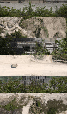
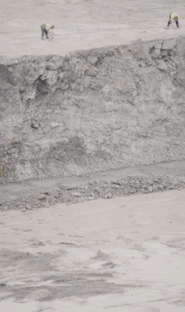
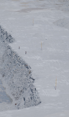
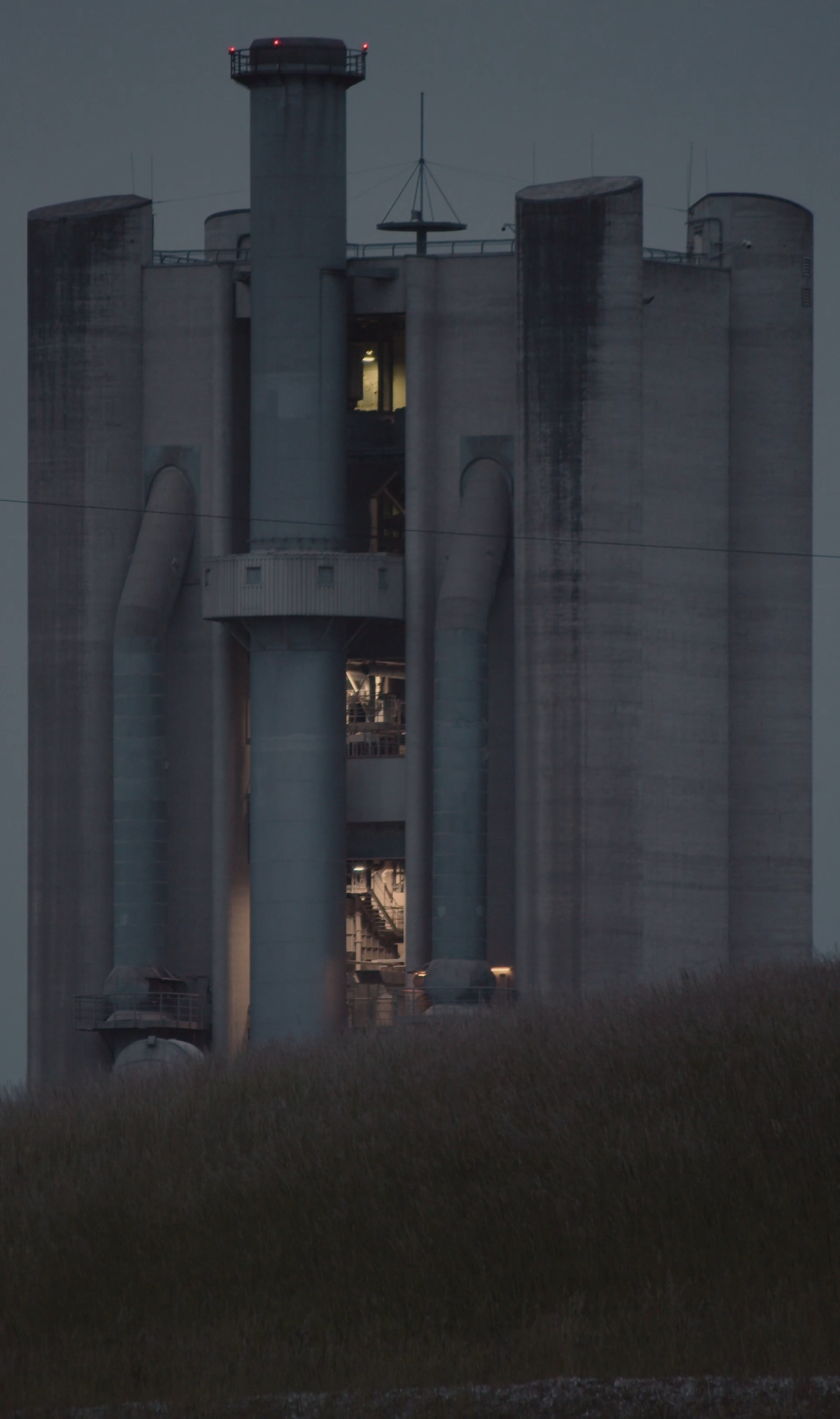
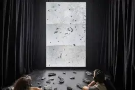
In The Presence of Absence" explores how the recontextualisation of quarries into nature reserves and hiking hotspots downplays human natural destruction. Grounded in research, the vertically stratified visual essay delves into the levels of exploitation involved, from territorial invasion to extraction and touristic activities, revealing hierarchies and the superior gaze of Western society.
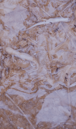
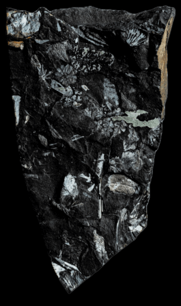
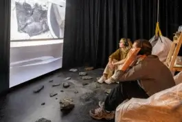
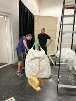
The installation reflects on three protagonists involved in extraction. Samples of slate, a mineral heavily used in the beginnings of industrialization for roofing of factories, show their iridescent fossillized flowers from 300 million years ago. Industrial Big Bags, whose invention replaced wooden barrels for material transportation, maximised logistical capacity and therefore the volume of extraction. Finally, the human takes seat in them, enjoying the comfort they provide. Some even fell asleep. Only leftover or reuseable materials, have been used for the set up, except the 160x240cm canvas.
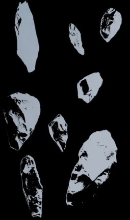
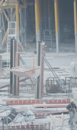
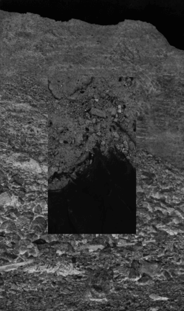
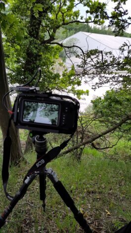
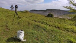
Film material has been recorded at the Piesberg and Dyckerhoff Quarries (DE) and a construction side in Münster (DE), negatives shown in the epilogue originate from the Dyckerhoff Lengerich Archive.
Three Channel Video Installation, 1920 x 3240px, 00:28:55, 2023
Shaped through milions of years, the ground yields our weight with infinite solidarity. Its fertile soil allows for roots to grow, graciously providing 95% of the nourishment we require to thrive. You, me, nonhumans — we all are deeply interwoven with the ground. It bears witness to all actions of its residents. As a permeable mebrane between past and present, it internalized Earths complex history layer by layer, down to the core. A mere centimeter of crafted topsoil passages 300 to 400 years. Driven by erosion, material artefacts downstream to the bottom of water bodies, percolate through sediments, and undergo cementation to solidify into rock.
Fossilized flowers portray mineral formation and the dignity of all materials. Miles under our feet they gleam in secret, too precious to be left uncovered. Convective currents in the Earth’s mantle orchestrate perpetual geological metamorphosis throughout expansive periods of time. Roaring through centuries and continents, sublime over concepts of control or ownership.
12,000 years ago. Untamed rivers flowed wildly in volatile environments, next to nomadic humanoids. 5,000 years later the availability of water began to exhibit predictability and sea levels stabilized globally due to polar glacier melting. Civilisations of the surface were confronted with new routines, among them us, the humans. Rich soil and regulated flooding facilitated the emergence of agricultural practices alongside the rise of early civilisations. Human quarrying activities of limestone and flint begin, guided by systematic quality evaluation. As a first impulse of human metaphysical reconstruction, space is organized through the erection of architecture – opening up questions of the self and the world, interiority and exteriority, life and death. Continual occupation fosters exclusion: With our roofs, ideas of ownership arise, providing a perspective of territorial control. It is specifically the western gaze that gradually turned from horizontal to vertical perspective, looking down on earth and every of it’s residents as a resource. Flat as a paved surface, aerial perspective keeps distance to the matter and reduces the physical world’s multifacted nature to an imaginative model of reality. Vertical gaze replaces the colonial idea of endless horizons by abundantly available minerals below the surface.
Announced by ascending clouds of mist, the industrial age begins.
Automation and mass production introduce a paradigma of unprecedented scale, shaped by its relentless hunger for resources. Western societies demand more and more of it, more than the skin of planet earth can provide. To comply with standards of living, the extraction of vital resources is externalized to specific regions, offering the desired abundance of resources. Scoop by scoop, Mines extend human presence vertically into the ground. Landscapes of absence emerge, as windows into the past. Former environments metamorphose into places shaped by profit—meticulously surveyed, possessed, utilized, and consequently, irreversibly altered. Rational calculation, abundant use of energy, and the precision of machines transform environmental violence into a wonder. Mines are also subject to criticism, but it is important to acknowledge that their flame is lit by our demands throughout decades. The global building floor is about to double by 2060, outspacing population growth by 50%. Our rising architectural adifices cast a shadow upon the hollow mountains left behind.
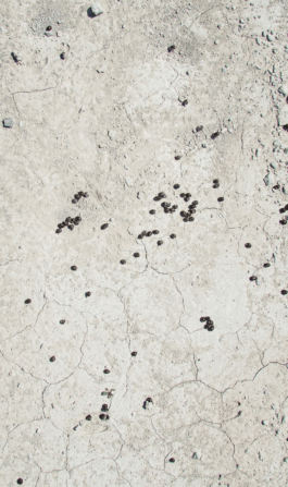
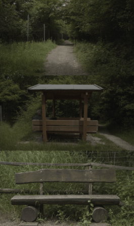
In far distance, the sources of our consumption fade away from immediate sight, becoming hidden within the fabric of our existence. Instead, they morph into silent spectacles. With 50-70% of altered ground worldwide, it is left to mines to present the pristine. Contextualized as recreation centers, violent marks of extraction become object to touristic gaze. Brought around its skin, sediment layers concealed for countless millenia are revealed, providing territory for alpine animals. Their excrement, sprinkles of irony. The planet wakes up, tickled by wheel loaders, blinded by the light. It falls asleep again, and keeps on spinning as before. Elevated hiking trails and viewing platforms offer tourists a superior, almost vertical perspective from above. The human spectator appears heroically larger in contrast to the massive scenery, which in its monotone miniature prevent emotional identification. Neither look the rolling machines to be harmful, the landscape to be detrimental, nor do those processes seem related to the room you are standing in. You are In The Presence of Absence.
Process
In The Presence of Absence" explores how the recontextualisation of quarries into nature reserves and hiking hotspots downplays human natural destruction. Grounded in research, the vertically stratified visual essay delves into the levels of exploitation involved, from territorial invasion to extraction and touristic activities, revealing hierarchies and the superior gaze of Western society.
Pertinent questions dealing with the “Architecture Of The Future” open up new contexts in various cluster topics to communicate in strategic and disruptive way. Complementary and polarizing approaches join and coordinate the different contexts and invite the visitors to face new realities.
Why
The ability to work in dynamic groups and forms has become increasingly essential for the development of any knowledge economy–related company. With the amplified influence of evolving technologies – artificial intelligence (AI) and deep learning – on working routines and the architectural design of working environments, not only do work spaces seem increasingly dated, but also their ability to adapt to future arrangements and uncertainties appears rather limited.
We always value a pioneering spirit to explore and innovate – just like many architects, builders, developers and users actually do. The current condition opens up a multitude of freedoms to pioneer. The format of the Architecture Panorama helps all actors become pioneers in their respective fields. To achieve this, the Architecture Panorama raises awareness of specifics and challenges related to the knowledge economy and provides clues to innovative approaches towards increasingly dynamic working routines and their respective impacts on the built environment.
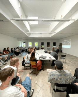
The installation of the Open Workshop at the Visual Stream exhibition is framed in a spatial break of various materials, both floating and static, with typographic and pictorial elements. Touchpoints like a thematic archive, filmic contexts, various infographics and theme worlds invite visitors to discover and grasp the vastness of the content. The staging is based on a visual panorama. Working through its three-dimensional the installation visualizes aesthetics and creates an overview scenario. Within all directions, viewers can anticipate impressions and content to get the impression of a holistic, complete density.
Client
Autonomous
Year
2023
Disciplines
Film, Editing, Installation, Writing
Process
Together with Pauline Gebauer I presented Neomatter and spatial type to the communication design students of FH Dortmund, specifically to the class of Andreas Ruhe (Morphoria) and Lars Harmsen (Slanted Publishers).
By example of our personal paths we showed them how Neomatter evolved, what is hot right now, where we are heading and how to work with 3-dimensional type.
The class is currently editing and designing the next edition of Slanted’s series of Experimental Type, guided by their tutors. Since many students work with 3D already or would like to explore the thematic, they invited us to gain insight from externals. Students will be provided with trials, we can’t wait to see them applied!
Thanks a lot for the invitation, attention and participation in discourse through questions or remarks.
Photo by Andreas Ruhe
Studio Daniel Gremme is working on a new website design for artist Karin Kytonkagas.
While living and working in Den Haag, her work is exhibited in many places, showing off predominantly paintings which can be described as humoristic, soft and trigger curiosity of the world around us. She wants art to be "more romantic, dreamy and escapistic”, and at the same time she translates "soft things into powerful statements.”
In a first meeting we spoke about her as an artist and reflected on how she wants to situate herself in the (art) world. A big step was to find a word for all the little and quick works she is producing next to her time consuming and at times large paintings: Ephemerals.
In collaboration with my colleague Camille de Noray I am working on a new website of the Tahitian Architect Bertrand Portier. His studio is specializes in architecture for tropical climate conditions and is one of the biggest in Tahiti. We'll share the results!
Neomatter has been selected for the Design Grant Scheme by @stimuleringsfonds (Creative Industries Funds NL). 💐
This project-bound grant will finance the development of a plugin for spatial typography. It allows to write out 3D letters on splines within Blender and Cinema4D, including several typographic functions. As a plugin, it can be seamlessly integrated into existing workflows.
With respectable experience in both typographic and spatial projects, we’re super glad to have @pointer_studio (Studio Pointer) by our side, who will develop the plugin for and with us. Specialized in media alchemy and software fiction, they are known to be called for things no one tried before, such as a variable font editor, on-spot and real-time 3D scanning of humans and astrophysical simulations.🪄
We can’t wait to run down the springboard and catapult this tool into the creative hands worldaround. A huge thanks to @stimuleringsfonds for their support!
From the 20th to the 24th of March 2023, I had the delightful opportunity to teach students from the Environmental Art Department at the Art Academy of Latvia in Riga.
The workshop, titled "Unleashing Letters," provided a unique blend of theoretical and practical aspects, aiming to transcend the realm of aesthetics. We delved into in-depth discussions about their individual projects to explore how they can conceive their work on a broader scale (political, social, etc.) and use typography to communicate their subjects subtly. Practically speaking, the students designed a typographic poster for their upcoming exhibition.
To begin, we closely examined the intricacies of Garamond, swiftly grasping its skeletal structure, the interplay of shapes, and how the tool's stroke shapes the outlines, among other aspects. To expand their understanding of the diversity in typography, we visited the Brasa Graveyard. Even in such a place rich in aesthetic connotations, students discovered a plethora of distinct letterforms that served as inspiration for developing their own lettering styles.
Throughout the workshop, most students chose to work on their posters using analog methods, allowing for rapid exploration and avoiding the need for specialized type design software. Additionally, I delivered public presentations on typographic storytelling, research methodologies in art, discerning good and bad typography, and shared insights from my own practice.
The students' remarkable progress in typography within just five days is truly commendable, considering most of them were novices in the field. Their ability to achieve such high-quality work in such a short period is truly impressive.
I would like to express my heartfelt gratitude to the Environmental Art Department, particularly Martins Vizbulis (Head), Linda Vilka, Līga Spunde, and Asnāte Balode, for their invitation to teach at the Art Academy of Latvia. Their support and collaboration made this workshop possible, and I am grateful for the opportunity to work with such talented and enthusiastic students.
The workshop has been funded by the EU Erasmus program and the Latvian State.
participating students
Ļena Kiseļčuka
Everita Vītola
Paula Ikase
Polina Bule
Raimonds Krastiņš
Katrina Lipšāne
Mareks Ziemelis
Hugo Pētersons
Dana Vetrova
Together with Alex Valentina and Vincent Wagner I will speak at the. Type Drives Culture Conference, organized by the Type Directors Club in New York.
After giving insight into the reasoning behind our 3D work, each of us will share individual experiences and discoveries in exploring digital and analog methods, the ongoing technological evolution and its inevitable impact on the physicality of Type. We will then invite the audience to an open discussion on key differences, commonalities and problems as well as the potential of 3D type.
Type and Technology. Spread over two classes I had the pleasure to give Glyphs and Cinema 4D Introduction Workshops at my former university Hochschule Düsseldorf/Peter Behrens School of Arts to the students of Prof. Holger Jacobs.
Class 01: Along basic theory about type design and technical knowledge they got introduced to the Glyphs interface and functions.
Class 02: In addition to a small lecture about my research on three-dimensionality and type the students will get an insight into basic principles of three-dimensional modelling, texturing and rendering in view of their class which is all about the creation of imaginative signs.
Nice to be back for two days. 📐
I'm releasing my first typeface Skanaus at The Designers Foundry!
Skanaus is pending between a classic approach and a wild, youthful contemporary attempt that urges for new shapes and is caried by a romantic attitude. Display, Display Alternate and Regular can be used on their own or in symbiosis.
It comes in 2 styles + 1 stylistic set, supports 219 languages and contains 551 glyphs inclusive 40 ligatures.
The Designers Foundry is retailing a selected catalogue of typefaces by independent designers around the world. TDF licensed typefaces to clients like Apple, Nike, Netflix, MTV, Virgin, Random House, Dolce and Gabbana, GAP, EA Games, Pentagram, ESPN and the BBC to
name a few. Thanks to Daniel McQueen and TDF.
thedesignersfoundry.com/skanaus
Together with Pauline Gebauer I presented Neomatter and spatial type to the communication design students of FH Dortmund, specifically to the class of Andreas Ruhe (Morphoria) and Lars Harmsen (Slanted Publishers).
By example of our personal paths we showed them how Neomatter evolved, what is hot right now, where we are heading and how to work with 3-dimensional type.
The class is currently editing and designing the next edition of Slanted’s series of Experimental Type, guided by their tutors. Since many students work with 3D already or would like to explore the thematic, they invited us to gain insight from externals. Students will be provided with trials, we can’t wait to see them applied!
Thanks a lot for the invitation, attention and participation in discourse through questions or remarks.
Photos can be found here
Studio Daniel Gremme is working on a new website design for artist Karin Kytonkagas.
While living and working in Den Haag, her work is exhibited in many places, showing off predominantly paintings which can be described as humoristic, soft and trigger curiosity of the world around us. She wants art to be "more romantic, dreamy and escapistic”, and at the same time she translates "soft things into powerful statements.”
In a first meeting we spoke about her as an artist and reflected on how she wants to situate herself in the (art) world. A big step was to find a word for all the little and quick works she is producing next to her time consuming and at times large paintings: Ephemerals.
In collaboration with my colleague Camille de Noray I am working on a new website of the Tahitian Architect Bertrand Portier. His studio is specializes in architecture for tropical climate conditions and is one of the biggest in Tahiti. We'll share the results!
Neomatter has been selected for the Design Grant Scheme by @stimuleringsfonds (Creative Industries Funds NL). 💐
This project-bound grant will finance the development of a plugin for spatial typography. It allows to write out 3D letters on splines within Blender and Cinema4D, including several typographic functions. As a plugin, it can be seamlessly integrated into existing workflows.
With respectable experience in both typographic and spatial projects, we’re super glad to have @pointer_studio (Studio Pointer) by our side, who will develop the plugin for and with us. Specialized in media alchemy and software fiction, they are known to be called for things no one tried before, such as a variable font editor, on-spot and real-time 3D scanning of humans and astrophysical simulations.🪄
We can’t wait to run down the springboard and catapult this tool into the creative hands worldaround. A huge thanks to @stimuleringsfonds for their support!
From the 20th to the 24th of March 2023, I had the delightful opportunity to teach students from the Environmental Art Department at the Art Academy of Latvia in Riga.
The workshop, titled "Unleashing Letters," provided a unique blend of theoretical and practical aspects, aiming to transcend the realm of aesthetics. We delved into in-depth discussions about their individual projects to explore how they can conceive their work on a broader scale (political, social, etc.) and use typography to communicate their subjects subtly. Practically speaking, the students designed a typographic poster for their upcoming exhibition.
To begin, we closely examined the intricacies of Garamond, swiftly grasping its skeletal structure, the interplay of shapes, and how the tool's stroke shapes the outlines, among other aspects. To expand their understanding of the diversity in typography, we visited the Brasa Graveyard. Even in such a place rich in aesthetic connotations, students discovered a plethora of distinct letterforms that served as inspiration for developing their own lettering styles.
Throughout the workshop, most students chose to work on their posters using analog methods, allowing for rapid exploration and avoiding the need for specialized type design software. Additionally, I delivered public presentations on typographic storytelling, research methodologies in art, discerning good and bad typography, and shared insights from my own practice.
The students' remarkable progress in typography within just five days is truly commendable, considering most of them were novices in the field. Their ability to achieve such high-quality work in such a short period is truly impressive.
I would like to express my heartfelt gratitude to the Environmental Art Department, particularly Martins Vizbulis (Head), Linda Vilka, Līga Spunde, and Asnāte Balode, for their invitation to teach at the Art Academy of Latvia. Their support and collaboration made this workshop possible, and I am grateful for the opportunity to work with such talented and enthusiastic students.
The workshop has been funded by the EU Erasmus program and the Latvian State.
participating students
Ļena Kiseļčuka
Everita Vītola
Paula Ikase
Polina Bule
Raimonds Krastiņš
Katrina Lipšāne
Mareks Ziemelis
Hugo Pētersons
Dana Vetrova
Together with Alex Valentina and Vincent Wagner I will speak at the. Type Drives Culture Conference, organized by the Type Directors Club in New York.
After giving insight into the reasoning behind our 3D work, each of us will share individual experiences and discoveries in exploring digital and analog methods, the ongoing technological evolution and its inevitable impact on the physicality of Type. We will then invite the audience to an open discussion on key differences, commonalities and problems as well as the potential of 3D type.
10 05 22
Type and Technology. Spread over two classes I had the pleasure to give Glyphs and Cinema 4D Introduction Workshops at my former university Hochschule Düsseldorf/Peter Behrens School of Arts to the students of Prof. Holger Jacobs.
Class 01: Along basic theory about type design and technical knowledge they got introduced to the Glyphs interface and functions.
Class 02: In addition to a small lecture about my research on three-dimensionality and type the students will get an insight into basic principles of three-dimensional modelling, texturing and rendering in view of their class which is all about the creation of imaginative signs.
Nice to be back for two days. 📐
12 11 20
I'm releasing my first typeface Skanaus at The Designers Foundry!
Skanaus is pending between a classic approach and a wild, youthful contemporary attempt that urges for new shapes and is caried by a romantic attitude. Display, Display Alternate and Regular can be used on their own or in symbiosis.
It comes in 2 styles + 1 stylistic set, supports 219 languages and contains 551 glyphs inclusive 40 ligatures.
The Designers Foundry is retailing a selected catalogue of typefaces by independent designers around the world. TDF licensed typefaces to clients like Apple, Nike, Netflix, MTV, Virgin, Random House, Dolce and Gabbana, GAP, EA Games, Pentagram, ESPN and the BBC to
name a few. Thanks to Daniel McQueen and TDF.