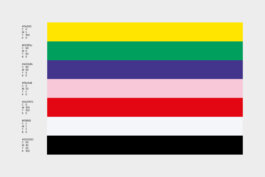
Voit
2022, Visual Identity
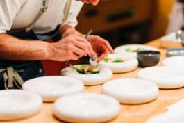
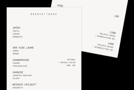
Voit is a restaurant for fine dining with the speciality of using as little spices as possible.
We reduced the visual identity to its bare typographic minimum, with a pinch of connotation to their zero spice policy.
design: Dorfmeyster / Johannes Götze, Jan Grebenstein, Daniel Gremme
sound design: Jan Grebenstein
typefaces: GT America / Grilli Type
photographs: Can Wagener


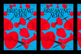
Breaking News
2022, Campaign, 3D
For this one day exhibition 10 students of the Non Linear Narrative masters program chose a particular news event to investigate. In their research they dissected the language that was used to write about the event, the images that were used and looked at the wider context of the events. From this they created installations to portray the chosen events in a different light.
In current times we witness a prevalence of mis-information but in it's most honest state, news media is a tool to empower the informed. It exposes the audience to current-affairs and in turn can unveil the current-affairs to the public. This is a vital in all societies. But this system is not without its flaws. It often happens the news lacks the perspectives of underprivileged people or marginalised groups. Or produces exaggerated stories for easy money. Or is used as a mouthpiece for the dominant political powers. For these reasons we must also look critically at what and how news is reported.
Students: Lisette Alberti, Lode Nicolaas Dijkers, Leonie Gores, Daniel Gremme, Shouyi He, Alicja Konkol, Eszter Nagy, Julija Panova, Camille Roland de Noray, Karolina Uskakovych.
Class Supervision: Judy Wetters (Material Lab), Lauren Alexander (Critical Storytelling), with special guest Boris van Westering.
Design: Camille de Noray, Daniel Gremme
Typeface: Ronaldson by Canada Type


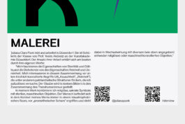
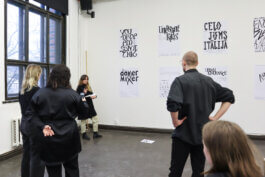
Outside Through Within
2023, Visual Identity
Outside Through Within is the graduation show of the master Non Linear Narrative at the Royal Academy of Arts.
Through the constant deconstruction and reconstruction of our own gaze, this show questions established narratives. By building narratives that deconstruct and reconstruct how we think about the world, we force ourselves, and invite the audience, to look differently. Outside through Within looks at palaces that aren’t really palaces. Tomatoes as seeds of connection between generations and throughout war. At sticky screens, capturing our attention. We look at the outside to see what is within.
Art Direction:Camille de Noray, Julija Panova, Daniel Gremme
Cover/Poster: Daniel Gremme
Editorial: Camille de Noray
Illustration: Julija Panova
Typeface: Union by Radim Pesko
Lettering: Daniel Gremme


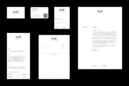
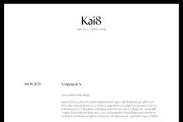
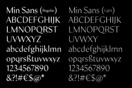
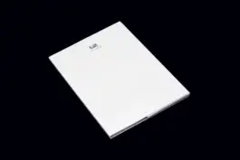
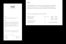
Kai8
Visual Identity, 2021
Full-Service for Kai8, a newly founded dentist and facial surgery practice. I was responsible from naming to design, paper choice, print shop communication and more. The identity provides patients with an advance of trust through a clear, but graceful visual language. A clinically clean layout system, the absence of colors and a humanistic but contemporary typeface shape the appearance, topped with a fine but important cut in the 8, which performs the idea of aid and well-being.
Art Direction: Daniel Gremme
Typeface: Min Sans by Typeji / TienMin Liao


Visual Stream Architecture Panorama
2019, Visual Identity
Cooperation of HSD university of Applied Sciences Düsseldorf with VITRA and ETH Zurich for an exhibition and performative stage installation at the BAU Munich 2019.
This open workshop at the Visual Stream exhibition involves all visitors such as architects, industry partners, fabricators, students and other stakeholders at the construction trade fair. It opens an complex architecture panorama to the recipients and conveys direct, comprehensive and realistic impressions of current challenges in the workflow and examples of future-oriented workplace architecture. Pertinent questions dealing with the “Architecture Of The Future” open up new contexts in various cluster topics to communicate in strategic and disruptive way. Complementary and polarizing approaches join and coordinate the different contexts and invite the visitors to face new realities.
Idea and Curation: Raphael Gielgen (Trendscout Vitra)
Content and Curation: Dr. Sonja Berthold, Dietmar Leyk
Project Lead HSD: Merlin Baum, Prof. Laurent Lacour
T. Realisation: Alexander Mainusch, Clemens Müller
Concept: Pauline Gebauer, Ina Germer, Marina Jötten, Cheongla Kim
Project Management: Pauline Gebauer, Ina Germer, Marina Jötten, Cheongla Kim, Sarah Kvasznicza
Realisation: Max Boegge, Daniela Brauer, Isabell Derenthal, Victoria Ezrer, Daniel Gremme, Jens Mirbach, Anne Ossenbühl, Isabel Paulini, Joelle Schonhoff, Florian Stolle
Photographs: Max Bögge, Florian Stolle, Alexander Mainusch, Pauline Gebauer, Clemens Müller
Typefaces: Druk by Commercial Type


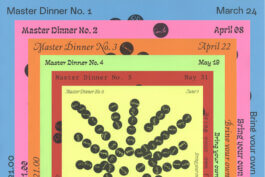
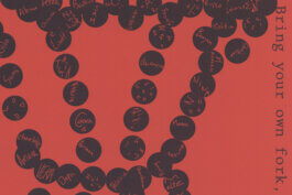
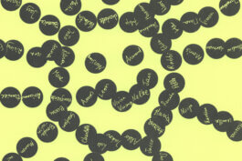
Master Dinner
2022, Visual Identity
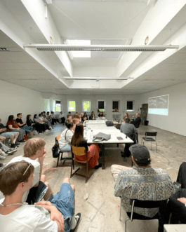
The Master Dinners are a series of dining events as a platform to encourage social exchange and collaboration across departments within the Royal Academy of Art, The Hague. Every month, a different MA program had to organize their event.
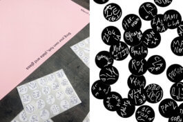
Social dynamics of hosting, organising and dining together are translated into the guiding principles for this poster series: Each MA program was provided with a poster template, stickers and list of names of all invited students. One name per sticker, the stickers were distributed within the group. These served as elements to design one motif each, representing the respective event. Pre-drawings or elements other than the stickers were not allowed. By this, spontaneous collaboration interlocked with collective thinking offers a participatory experience that works against conventional mechanisms of capitalistic perfectionism. In addition, the design already begins to engage with the participants - who is Lisette, Georgina or Alexey?
Design: Camille de Noray, Daniel Gremme, all MA students
Typefaces: Mueller by Benn Zorn, Ballo by Anna Khorash, Contrast Italic by Jacob J. Wise, Clemantine by Marte Verhagen, Contrast Mono by Lea Bruneau, Loza by Anna Khorash (KABK TypeMedia students)


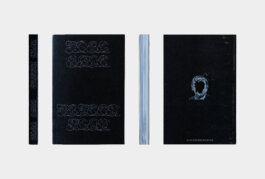
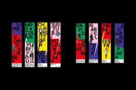
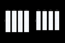
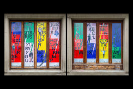
How Would You Like to Get Lampooned, My Lord?
Book, Event, Collaboration, Presentation
2022-2023
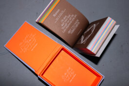
This publication is the result of a semester-long research collaboration between the Non Linear Narrative programme (KABK) and the KB, National Library of the Netherlands, during which students scrutinised the library’s comprehensive catalogue of alba amicorum and created new, compelling narratives that link these friendship books to contemporary urgencies.
Text and image contributions covered topics like privilege, gender discrimination, colonialism and institutional archiving practices. The individual student projects and essays insode relate to alba amicorum, friendbooks from the 15th century that portray, recreate and solidify elitist communities.
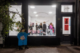
On Thursday 17 November 2022, we released the book at Page Not Found in The Hague. The evening programme included short drawing sessions of living alba portraits by Julija Panova, the cutting of a delicious alba cake and a live performance by Kami Million. Furthermore we presented the design process at KB and sold some of the 500 copies at Douwes bookstore in The Hague.
[Lampooning is a text, drawing or another form of visual critique using ridicule or irony. Synonym: parody, satire, spoof]
project supervision: Niels Schrader, Linda van Deursen
printer: Robstolk Amsterdam.
editorial design: Camille de Noray
typefaces: Gablet by Jacob J. Wise, Lampoon by Daniel Gremme
window design: Camille de Noray, Daniel Gremme
photographs: Roel Backaert, Daniel Gremme


Noch Nicht Gedrehte Filme
Films Not Yet Filmed
2019, Book Design, Illustration
35 short stories, once written as a column for DU magazine, summarized in one volume. Misanthropy, irony and panic join here in cheerful brutality.
The volume is divided into five chapters of seven stories each, with each one increasing in content and visual appeal to pain. However, the dosage of that pain is left to the reader's discretion, each story works on its own, as does the image created by five different experimental layout systems.
Together with found-footage images of the actors (Kalt chose as the characters) and extending serifs, the visual level supports the textual one.
Stories: Jörg Kalt
Supervision: Prof. Victor Malsy
Typefaces: Ronaldson by Alexander Kay / Canada Type, Jabin by Frida Medrano


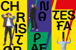
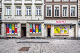
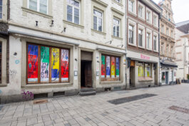
Eine Ausstellung Mit Geschmack
An Exhibition With Taste
2023, Campagin
Campaign for the Kassel market hall during documenta 15.
Market halls have their own rules - here, quality still focuses on the palate. While straightforward, perfectly lit supermarkets present goods as industrial units, a visit to the market hall is less blunt. The presence of flawed and thus honest moments makes this place seem warm and heartfelt, for this also reflects on its visitors. Accordingly, the lettering inspired by price tag inscriptions is idiosyncratic.
Design: Johannes Götze, Jan Grebenstein, Daniel Gremme
Photographie: Can Wagener, Daniel Gremme
Lettering: Daniel Gremme


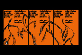
Autumn Break Kickoff Party
2021, Campaign
A self initiated autumn break party organized by Non Linear Narrative first year students at the Royal Academy of Art, The Hague.
Sketchy, bright and vivid elements embrace fun and failure. Dance as wild as you like, and make sure to have a well deserved rest afterwards.
Design: Camille de Noray, Daniel Gremme
Typeface: Magiel by Mateusz Machalski


Neomatter
2021, 3D Type Design, Tool Design, Webdesign, Filmmaking
In a digital culture with increasing virtual immersive experiences, the question arises as to how the two-dimensional concept of type can be transferred into multidimensionality.
Contrary to the virtual target medium, I worked directly on the material, using programmes only for digitisation, to follow a workflow guided by my senses rather than programmed rules.
The result of this work is Neomatter, a three-dimensional typeface. Cut out of expanded polystyrene, digitally processed and available in RAW and EDGE cuts.
This project is evloving into a foundry right now: neomatter.xyz
Concept and Design: Daniel Gremme
Supervision: Andreas Uebele, Holger Jacobs
Programming: Hannes Drescher
Video und Cut: Marvin Hillebrand, Daniel Gremme
Video Assistance: Tim Mittenmaier
Sound Design: Jan Kunz
Photographs: Tim Mittenmaier, Daniel Gremme


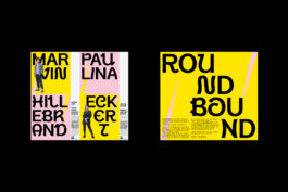
Roundbound
2021, Campaign
Roundbound is a platform for exchange among young artists and creatives.
In August 2021, an exhibition with all participating artists has been planned as a kick-off. The angular, the round, the energetic and emerging, roundbound in full bloom.
On display at Brauerei Kürzer, Düsseldorf. Roundbound is a project by Marvin Hillebrand and Paulina Eckert.
Typeface: Blow by Yanik Hauschild / Nice To Type
Photographs: Marvin Hillebrand
Various Letterings
2021-2023
A collection of letterings for clients or personal pleasure.


Skanaus
2020, Type Design
Skanaus mingles between classical and contemporary type genres with it's wild details creating unexpected forms that bring a sense of romance and movement across the glyph set.
It comes in a single weight in regular and display styles. Display also includes a set of alternates. I began the design and development of Skanaus during an exchange semester in Vilnius. Elements of the design are influenced by the culture and the architecture of the region. This is my first release and was supervised by Prof. Aušra Lisauskiene and type designer Henning Skibbe.
Released in 2020 at The Designers Foundry.


Institut (Work in Progress)
2022-2023, Type Design
Corporate Typeface for the documenta Institut.
Clear inktraps, a mixture of horizontal and oblique stroke endings provide simple yet distinct characteristics in the frame of a clean grotesque.
Overshooting ascenders and descenders, varying stroke width and clear joints (see n) increase its readability.
To be extended in weights and widths.


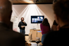
Unleashing Letters
2023, Workshop/Teaching
From the 20th to the 24th of March in 2023, I had the delightful opportunity to teach students from the Environmental Art Department at the Art Academy of Latvia in Riga. The workshop, titled "Unleashing Letters," provided a unique blend of theoretical and practical aspects, aiming to transcend the realm of aesthetics.
We delved into in-depth discussions about their individual projects to explore how we can conceive our work on a broader scale (political, social, etc.), while also honing their typographic skills through the design of a typographic poster for their upcoming exhibition. The students' remarkable progress in typography within just five days is truly commendable, considering most of them were novices in the field.
Photos: Asnāte Balode


A brief selection of Articles, Publications and more.